


Home hygiene has long been an essential part of a healthy lifestyle, but it has increasingly become a routine element of daily life. In response to heightened awareness of health and safety, people now regularly disinfect a wide range of items—from fruits and vegetables to household surfaces and personal devices—to reduce the risk of virus transmission.
A clean home also contributes to psychological well‑being. According to a Clorox survey, 80% of consumers feel more relaxed in a clean environment, 72% report greater productivity, and 60% experience reduced stress. As a result, consumers consistently invest in household cleaning products such as surface disinfectants, dishwashing liquids, and other cleaners.
At the same time, brands are placing greater emphasis on transparency, environmental responsibility, and sustainability, integrating these values into both product formulation and packaging design. While traditional cleaning products have often relied on bright colors and gradients to communicate strong cleaning power, natural products tend to adopt simpler visual languages—such as white or transparent packaging and minimal color palettes—to convey purity and honesty. In the post‑COVID era, consumer demand is increasingly shifting toward eco‑friendly ingredients, fresh scents, and formulas free from harsh chemicals. Looking ahead, trends in home cleaning products are expected to include multifunctional solutions, refillable packaging systems, and portable formats designed for everyday convenience.
Packaging for Various Types of Detergents and Hygiene Products
1. Carpet Care Packaging Design
Carpet care packaging is typically designed to be easily recognizable on retail shelves, often using bright and eye‑catching colors that help the product stand out and attract consumers. The design usually varies according to the product type and its intended application. In addition to visual appeal, the packaging communicates essential information such as usage instructions, recommended quantities, and technical guidance. Labels also highlight key product benefits, such as enhanced softness, quick application, or improved appearance of the carpet. Accordingly, the shape and structure of the packaging container may differ depending on the product category, often incorporating user‑friendly features that facilitate convenient and efficient use.

2. Disinfectant Cleaner Packaging Design
Disinfectants are generally divided into two categories: surface disinfectants and fruit‑and‑vegetable disinfectants. Because fruit and vegetable disinfectants are used on edible items, their packaging should convey a pleasant, domestic character suitable for kitchen environments. The visual language should feel clean and reassuring rather than strongly associated with harsh hygiene products.
At the same time, the bottle and container design should not resemble food items in order to prevent confusion or accidental consumption, nor should it closely resemble hazardous cleaning agents. Soft, eye‑pleasing colors and imagery such as fruits, vegetables, or flowers can help communicate freshness and safety. The packaging should also clearly present essential information, including usage instructions, dosage, ingredients, benefits, and storage guidelines.
In contrast, surface disinfectant packaging can adopt a stronger visual identity, often using bold and vibrant colors to signal cleaning power. The label should clearly indicate suitable surfaces for application, and displaying the percentage of microbes eliminated on the front of the package can reinforce the product’s effectiveness and value.

3. Packaging Design for Drain Opener Products
Drain openers are available in various sizes, from small sachets to large bottles. Common imagery on these packages includes sinks, drains, pipes, and water flow. Since transparent packaging is rarely used for drain openers, the label design must be contrasting yet attractive. It’s also helpful to provide an explanation of the purpose of each ingredient. The value proposition should be stated on the front, which could include points like dissolving grease and hair clogs, being ready to use, odorless, safe for all pipes, etc.
The use of chemicals should be stated, and warnings must be highlighted to prevent any dangerous incidents. These products are typically offered in black or white containers to ensure clear visibility of the label and showcase their benefits. Simultaneously, when designing the packaging containers and labels for these cleaning agents, efforts should be made to consider safety measures related to accidental misuse by children. This includes using child-resistant caps and employing colors, images, and graphic forms that do not evoke food items, and even avoiding food-grade scents in their fragrance. The design should primarily convey a sense of chemicals and industrial use.

4. Packaging Design for Floor and Surface Cleaners
Various fragrances are added to floor cleaning liquids to create a pleasant aroma during mopping. These scents can include lemon, rose, sandalwood, jasmine, and more, with the packaging design being tailored to the specific fragrance and ingredients. Color can be an excellent differentiator for product packaging. Images on the packaging typically feature clean surfaces where children and pets are playing, emphasizing the non-toxic nature of the formulas.
The packaging design for these products should be narrow at the neck of the bottle to facilitate an ergonomic grip and easy handling. It should also include indicators for gripping, guiding consumers on where to place their fingers.

5. Bottle and Label Design for Glass and Mirror Cleaning Solutions
The shine factor is a crucial feature that this product should deliver, so the packaging design should also reflect this. Alongside mirrors/glass, other items that can be cleaned and made shiny with this product should be mentioned in the packaging design. Images of clean, sparkling glass or imagery evoking brilliance and clarity should be incorporated into the packaging design. The colors most commonly used are green and blue, as they represent cleanliness and purity.
The functional identity and brand personality of these products should be evident in their packaging design. This could include features like shine enhancers, being hygiene-oriented, offering double the shine, or extra power for eliminating germs, all of which should be clearly indicated. The size and benefits should also be displayed on the label information.

6. Plastic or Cardboard Packaging Design for Hand Soaps
The packaging for hand soaps is designed based on the type of soap, whether it is liquid or bar. The ingredients are very important, with colors and fragrances (e.g., lemon, mint, fruity flavors) dictating the packaging design, ensuring that the ingredients are mentioned in the design.
How the product eliminates viruses is one of the main value propositions that should be emphasized. The benefits of nourishing ingredients for the hands add a unique selling proposition (USP) for the consumer, influencing their purchasing decisions. In terms of packaging form design, the ability to identify the product’s contents and give identity to the product family are among the primary parameters in designing these containers.
Creating innovative forms that are simultaneously consistent with the identity of hand-washing products is a key item in selecting packaging designs. The scalability of the packaging’s form and appearance across all related products should be considered in both the 3D design of the container and the graphic design of the product labels. The use of colors, images, and forms that evoke a sense of cleanliness, hygiene, and gentleness is essential.

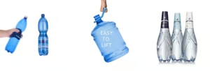
7. Container and Label Design for Industrial Cleaners
These products are primarily seen in jugs, gallons, and bulk bottles as they are used in large quantities for commercial purposes. Attention to the content and communication of concepts in the packaging design is very precise, and here the informational value is much greater than the aesthetic appeal or attractiveness of the packaging.
Occasionally, these products are found in transparent containers, where the label and sticker are then designed in a contrasting color to the bottle. Cautionary instructions, usage patterns, dosage information, chemical content, and storage details are mandatory here. In the packaging design of these cleaning products, industrial forms and dark, high-contrast colors should be used to convey a sense of chemical and non-food nature.

8. Container and Label Design for Laundry Products
There are various parameters in the packaging design of laundry detergents, including the 3D form and shape of the bottle and packaging container, the method of sealing the container, the form and harmony of the label with the shape and surfaces of the container, visual identity and label graphics, ease of use, and conditions for transportation, storage, and distribution of the packaging. All of these can create a different user experience.
In the design of liquid laundry detergent containers, the product is typically distributed in various weights in the market based on consumer needs, with sizes usually varying between one to three and a half liters. The design of these containers should ensure that the bottle’s 3D form and identity are consistent with the product family, and that form scalability is considered during the design process.
Ease of use and the needs of different users, from elderly individuals requiring lighter packaging for smaller loads to large families needing convenience and cost-effectiveness in bulk purchases, are parameters that designers must consider in various usage scenarios. The images, bottle color, and container design of washing products like liquid laundry detergent should first be designed for easy identification on store shelves. Secondly, differentiation and innovation in design can encourage customers to purchase the product.
Handling, ease of opening the bottle cap, the ergonomics of the handle, and a comfortable grip when pouring the contents into the washing machine’s detergent compartment, as well as considering how it will be stored back in the home environment, are among the main parameters for designing these products.
When designing the surfaces of sanitary detergent bottles where the product label will be applied by labeling machines, attention must be paid to the uniformity of the surfaces and curves on the bottle body. This ensures that the form does not collapse inwards during labeling and has sufficient resistance to impact. It should also prevent the label from peeling off at the corners or sections over time, mainly due to uneven labeling surfaces on self-adhesive labels. The surfaces should be sections of a cylinder so that the label does not detach from the surface over time.

Key Aspects of Household Product Packaging Design
1. Child Safety
Packaging design must address significant concerns regarding the unsuitability of materials and their potential danger to children. Looking at the current trend, people prefer products with child-resistant packaging. There are many types of child-resistant packaging that address child safety concerns while remaining suitable and user-friendly for all adults, including the elderly. Care should also be taken in label design, the type of fragrance, and the choice of shapes and images to ensure the packaging design does not evoke a sense of edibility for children. Color and imagery selection are the most critical parameters in this type of misuse by children. However, families should ensure that these products are stored out of reach of children, preferably in cabinets with doors.
2. Sustainability
People understand their social responsibility towards society and the environment, hence brands have started practicing sustainability and realized that PET materials (materials made from polyethylene terephthalate) are often less efficient in terms of form.
While green companies have noted that natural polymers, which may sometimes appear opaque, are much more sustainable and environmentally conscious. Therefore, your packaging design should convey this reason with natural and earthy colors, creative content, and the recycling symbol. It might seem like a small thing, but when a customer sees the recycling symbol on a container, it helps them feel good about their purchase.
3. Cost-Effectiveness
Recyclable plastic can be used, which is also inexpensive to produce in bulk and reduces transportation costs. Overall, its transportation cost is lower compared to glass or metal.
4. Attractive Packaging
The aesthetic appeal of your product is key to a strong shelf presence and contributes to its purchase, providing a competitive advantage that cannot be overlooked compared to the label or packaging design of others. Attractiveness is the result of the design team’s unique perspective during the design process and the use of creative design methods and techniques.
5. Plastic Bottles and Containers
High-density polyethylene (HDPE) is commonly used for detergents and similar products. As it is a strong plastic, it can resist UV penetration, withstand extreme temperatures, and is a semi-transparent, non-rinsable plastic.
Effective cleaner packaging does more than protect the product — it communicates trust, improves usability, and strengthens brand identity. From safety considerations to shelf appeal and sustainability, every detail matters in creating successful packaging for household cleaning products. At Ekas Design, we help brands develop packaging solutions that are functional, visually compelling, and aligned with market expectations. If you are looking to design cleaner packaging that stands out and performs well, our team is ready to help.
conclusion
In the packaging design of cleaning products, visual identity, user safety, and clear communication all play a crucial role in shaping consumer trust and product value. Whether for surface disinfectants, carpet care, or fruit and vegetable cleaners, the packaging must reflect the product’s function, target use, and level of safety in a way that is both practical and appealing.
As consumer expectations continue to shift toward convenience, transparency, and sustainability, packaging design is no longer limited to protection and aesthetics alone. It has become an essential part of the product experience, helping brands differentiate themselves while also guiding users toward safer and more effective use. Ultimately, successful packaging design combines functionality, clarity, and visual appeal to create a stronger connection between the product and its audience.